A Bigger Better Bootstrap Book: Bootstrap Site Blueprints

Last year I published a little Bootstrap book. I immediately wanted to write a next, bigger one. To help me pull it off, I teamed up with my colleague Ian Whitley. We’ve written it. And it’s live.

We wrote the book for those who want to make use of Bootstrap without being constrained by it. Properly understood, Bootstrap is a tool — a truly excellent tool among other tools — meant to be used with a craftsman’s touch, toward an end defined by the craftsman, not by the tool.

Let’s break that down. If you’re like us, you want to:

1. Bootstrap your way to truly original designs.

You don’t want Bootstrap to define your design. “Built with Bootstrap” need not mean “looks like Bootstrap.”

2. Work directly with the LESS files.

Bootstrap’s LESS files are beautiful to behold. Through the course of these chapters, you’ll develop a truly modular workflow. You’ll use Bootstrap’s LESS files intentionally and selectively. And you’ll augment them with your own custom LESS files.

Even if you’re new to LESS, we would argue there’s no better way to learn than this. We’ll help you get from zero to serious fast.

(Nothing against SASS, by the way. We wrote the book before Bootstrap had an official SASS port.)

3. Leverage, then enhance, Bootstrap’s JavaScript.

Bootstrap comes equipped with JavaScript plugins for some of the most important and frequently used interface elements. We’ll walk you through the process of exerting detailed control over several of them. Beyond that, you may want to do additional things, such as add swipe interaction to the carousel for touch devices, animate the scrolling behavior for a single-page site, or add the PictureFill responsive image solution. We walk you through these things!

4. Optimize for performance.

While it is convenient to grab Bootstrap’s CSS and JavaScript from the online CDN, you realize that there are huge performance gains to be had by selecting only the styles and plugins you need and optimizing them for performance.

We walk you through a very manageable process for cutting things down to size. No more 120KB CSS files or 68KB JavaScript files. We’ll cut those numbers in half, or better, and we’ll work to keep the number of HTTP requests low.

Your sites will load faster. You’ll get better page speed results. Your users will be pleased.

5. Do the hard work to do good things well.

Bottom line: This book is for those willing to roll up their sleeves and dig into the guts of Bootstrap — the markup, the LESS, and the JavaScript — exerting thoughtful and careful control over the details — while creating mobile-first, user-friendly designs.

6. Oh, and Bootstrap yourself a custom WordPress theme!

I almost forgot to mention — we walk you through creating a custom WordPress theme based on the fantastic Roots Theme.

If you’re on board with these desires, this book is for you.

In the coming weeks, we’ll be supporting the book with helpful tips, recommendations, and code goodies. So stay tuned!


Bootstrap Site Blueprints
Packt Publishing, February 2014
Packt eBook (ePub, Kindle, PDF) or Print + eBundle
Buy Amazon paperback or Kindle edition

Resolving Breakpoint Conflicts in Bootstrap 3

Subtitled: the importance of the @screen-__-max variables

While testing a design for my upcoming Bootstrap 3 book (stay tuned, it’s coming soon!), I discovered the importance of the @screen-xs-max variable, and by extension the other @screen-__-max variables.

In my case, I had three columns set up using the class col-sm-4. This would lay them out side by side horizontally when the viewport width is above the @screen-sm breakpoint (by default 768px).

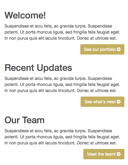
col-sm-4 cleared and padded

Then they would shift to a single-column layout below that breakpoint.

HOWEVER, because each column contained a floating button, the blocks of content were not clearing each other when arranged vertically. Buttons were flowing beside headings, and so on.

col-sm-4 not clearing

Thus, for the narrow single-column layout, I needed to set up a rule to force the columns to clear floating elements above them. I also wanted to add some vertical padding between them.

Easy fix not so easy

Seemed easy: Set up a media query with max-width: @screen-sm, and set up rules to clear floats and add padding only under that query.

On initial testing (i.e., resizing my desktop browser window), this seemed to work great.

col-sm-4 cleared and padded

The problem: This left a 1px zone where the columns remained narrow while clearing one another and thus still stretching down the screen vertically.

I didn’t find this until testing on the iPad mini, whose window width falls exactly in this 1 pixel zone! This was what it looked like:

iPad Screen Small Breakpoint Broken

After a bit of consternation-laden thought, I revisited Bootstrap’s breakpoint variables … and realized I’d stumbled on the reason for the @screen-__-max variables.

You’ll find these lines in Bootstrap’s variables.less file:

// So media queries don't overlap when required, provide a maximum
@screen-xs-max:              (@screen-sm - 1);
@screen-sm-max:              (@screen-md - 1);
@screen-md-max:              (@screen-lg - 1);

Note what these do: provide a breakpoint that is exactly 1px less than the next larger breakpoint — exactly what I needed to clear up this problem.

The problem and fix in LESS

Here are my LESS lines, with the original offending media query, now commented out and replaced with the new better one:

// @media (max-width: @screen-sm) { // BAD: conflicts 1px with col-sm in markup
@media (max-width: @screen-xs-max) { // GOOD: fits within col-sm in markup
  [class^="col"] { // set columns to clear floats and add padding
    clear: both;
    padding-bottom: 40px;
  }
}

That did it. Problem solved.

See it and test the difference in this Codepen.

Lessons Learned

  1. Even with Bootstrap 3’s powerful responsive grid, be sure to test breakpoints very carefully, and across devices, watching for 1px gaps.
  2. The @screen-__-max variables can be your friend!

See the relevant Bootstrap 3 docs here

Bootstrap 3 (RC1) is out! Tuts coming soon …

Huzzah!

At long last Bootstrap 3 is out — Release Candidate 1 that is. Read the blog post here.

Bootstrap 3 is a big deal. Some truly fantastic work has gone into it. Not least among the new touches — a new, more adept, mobile-first grid system.

I’m prepping a little introductory tutorial, which should be ready in the next few days. I hope to keep things going after that, with semi-regular tips and tricks for working with Bootstrap.

For those who enjoy working with Bootstrap in the context of the Roots Theme for WordPress, I’ve got some tuts in the works for you as well.

If that interests you, be sure to check back, and perhaps subscribe to receive updates.

Meanwhile, part of the reason I’ve been so quiet lately is that I’ve got a Bootstrap 3 book underway. My previous Bootstrap book was frankly too skinny. This one will be fatter, with blueprints for building a variety of types of websites using Bootstrap. I still have some writing, testing and revising to do. (So does Bootstrap 3 itself, during these two release candidate phases.) But I’ll be doing my best to get the book out as soon after the official release as possible!

Stay tuned.

WordPress and Bootstrap Lovers: Check out Shoestrap!

One could argue that WordPress is fast becoming the MS Word of the Web — except that it’s open source and has approximately 1.5 kajillion contributors hammering out and sharing enhancements for free or cheap.

Recently, the Roots Theme has taken serious WP development a step forward by learning extensively from the HTML5 Boilerplate, cleaning up some unnecessary WP cruft, and riding on Twitter Bootstrap’s excellent LESS-CSS/JS front-end toolkit.

Working with Roots as its starting point, Aristeides Stathopoulos takes us yet another step along the path to world domination (or at least WP development bliss). His Shoestrap Theme — available as a standalone fork of Roots or as a Roots child theme — combines all the goodness we’ve known and loved in the Roots theme, plus …

Shoestrap adds:

  • WordPress’s theme customizer, such as found in the Twenty Twelve theme, with controls for uploading a logo image, modifying the header and footer, setting the color of the navbar, selecting a Google web font, adding social links, and more.
  • Additional layout options, with primary and secondary sidebars.
  • lessphp baked in, enabling a developer to compile LESS live on an installed WP site. Enable the theme’s Developer Mode (a Shoestrap theme option), and phpless will check the theme’s Bootstrap-based LESS files and recompile them once you’ve saved edits to them.

Great, great stuff. Free, opensource, with the option to receive a free license for update notifcations when you download from the Shoestrap website. Also available on Github. (Thanks Aristeides.)

And of course Shoestrap has some nice free and premium plugins available as well.

Font Awesome Icons not Working in Firefox? Probable cause and a fix

Firefox refused to display my Font Awesome icons. After some research I found it was a cross-domain issue created by the fact that the files were being served from a CDN. (Specifically, WP Engine’s CDN.)

The fix for me was to place an .htaccess file inside the font directory containing these lines:

<FilesMatch ".(ttf|otf|eot|woff)$">
  <IfModule mod_headers.c>
    Header set Access-Control-Allow-Origin "*"
  </IfModule>
</FilesMatch>

This cleared it up for me. All now works as it should.

Catalin Rosu nicely explains the situation and the reason behind it here. (Firefox is actually behaving as it should.) If you’re using an nginx for your webserver, Rosu also mentions a possible additional required step.

One other potential alternative option is to embed the fonts as base-64.

Fix Twitter Bootstrap’s Dropdown Menus in Touch Screens

With Twitter Bootstrap’s 2.1 release, and running through the current version 2.2.1, dropdown menus have stopped working as they should in iOS and Android. Try to tap a submenu item, and the nav simply disappears. See the Github issue here. It is currently slated to be fixed in the upcoming 2.2.2 release, and I’m confident it will be addressed.

Until then, this quick little hack has worked for me. Add the following line of JS after Bootstrap’s bootstrap-dropdown.js (either in your own JS file or by adding it to Bootstrap’s JS):

$('body').on('touchstart.dropdown', '.dropdown-menu', function (e) { e.stopPropagation(); });

Since then, dropdown menus work as they should in iOS and Android, and I’ve noticed no adverse effects on non-touch devices.

Credit: @blakeembrey’s Github comment here

UPDATE for Bootstrap Version 2.3.2

@robdodson has posted this fix for version 2.3.2 in Github:

$('.dropdown-toggle').click(function(e) {
  e.preventDefault();
  setTimeout($.proxy(function() {
    if ('ontouchstart' in document.documentElement) {
      $(this).siblings('.dropdown-backdrop').off().remove();
    }
  }, this), 0);
});