Resolving Breakpoint Conflicts in Bootstrap 3

Subtitled: the importance of the @screen-__-max variables

While testing a design for my upcoming Bootstrap 3 book (stay tuned, it’s coming soon!), I discovered the importance of the @screen-xs-max variable, and by extension the other @screen-__-max variables.

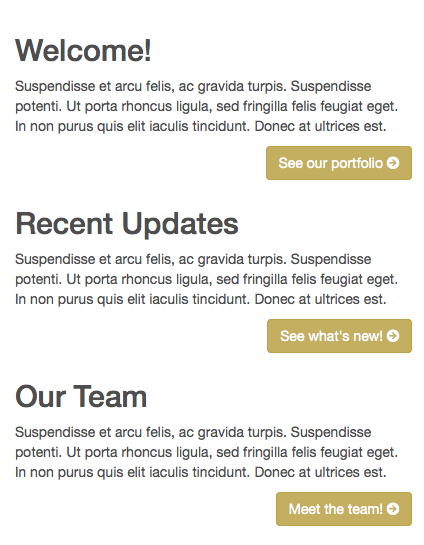
In my case, I had three columns set up using the class col-sm-4. This would lay them out side by side horizontally when the viewport width is above the @screen-sm breakpoint (by default 768px).

col-sm-4 cleared and padded

Then they would shift to a single-column layout below that breakpoint.

HOWEVER, because each column contained a floating button, the blocks of content were not clearing each other when arranged vertically. Buttons were flowing beside headings, and so on.

col-sm-4 not clearing

Thus, for the narrow single-column layout, I needed to set up a rule to force the columns to clear floating elements above them. I also wanted to add some vertical padding between them.

Easy fix not so easy

Seemed easy: Set up a media query with max-width: @screen-sm, and set up rules to clear floats and add padding only under that query.

On initial testing (i.e., resizing my desktop browser window), this seemed to work great.

col-sm-4 cleared and padded

The problem: This left a 1px zone where the columns remained narrow while clearing one another and thus still stretching down the screen vertically.

I didn’t find this until testing on the iPad mini, whose window width falls exactly in this 1 pixel zone! This was what it looked like:

iPad Screen Small Breakpoint Broken

After a bit of consternation-laden thought, I revisited Bootstrap’s breakpoint variables … and realized I’d stumbled on the reason for the @screen-__-max variables.

You’ll find these lines in Bootstrap’s variables.less file:

// So media queries don't overlap when required, provide a maximum
@screen-xs-max:              (@screen-sm - 1);
@screen-sm-max:              (@screen-md - 1);
@screen-md-max:              (@screen-lg - 1);

Note what these do: provide a breakpoint that is exactly 1px less than the next larger breakpoint — exactly what I needed to clear up this problem.

The problem and fix in LESS

Here are my LESS lines, with the original offending media query, now commented out and replaced with the new better one:

// @media (max-width: @screen-sm) { // BAD: conflicts 1px with col-sm in markup
@media (max-width: @screen-xs-max) { // GOOD: fits within col-sm in markup
  [class^="col"] { // set columns to clear floats and add padding
    clear: both;
    padding-bottom: 40px;
  }
}

That did it. Problem solved.

See it and test the difference in this Codepen.

Lessons Learned

  1. Even with Bootstrap 3’s powerful responsive grid, be sure to test breakpoints very carefully, and across devices, watching for 1px gaps.
  2. The @screen-__-max variables can be your friend!

See the relevant Bootstrap 3 docs here

Coyier and Walton on Responsive Web Design Process

If you’ve not seen them, these two recent and excellent reads pull together a number of instructive tips for responsive web design process.

Chris Coyier, “Notes to an Agency Starting Their First Responsive Web Project”

This is a well crafted, succinct list providing summaries (with links!) of important emerging responsive design trends.

Choice notes include:

  • “Designing first for a small screen means making the tough decisions about what is most important and what can be cut.”
  • “Don’t think in terms of exact screen sizes.” — with rationale
  • “Use as much ‘real’ of data/copy/media as you can.” — because real content makes a difference when designing for a wide range of devices and form factors
  • “Hover is totally out.” (with a helpful link to this piece by Trent Walton)

Jump to Coyier’s post

Speaking of Trent Walton, he’s just published a fantastic overview of his working process.

Trent Walton, “Where to Start”

Also a series of notes, in very readable paragraph form (and benefiting from Walton’s wonderful knack for typographic design).

Some of my favorite points, each illustrated with helpful thoughts and examples:

  • “ditching the assembly line method of site building for a more communicative, iterative process will be helpful.”
  • “I still use Photoshop, but I use it differently.”
  • “I finish in a mobile-first fashion,” but “I begin with wide views because the layout is usually more complex.”
  • “let media queried breakpoints be defined by content/layout rather than any specific device. Whenever things don’t fit or hierarchy breaks, add a media query. My favorite example of this is if we set a max-device-width media query at 480px to target an iPhone 4, the iPhone 5 wouldn’t display any of the targeted styles because the screen is larger.”

Well worth reading, contemplating, and assessing.

Jump to Walton’s post

A Little Twitter Bootstrap Book

For anyone who’d like a quick, friendly, step-by-step guide to Twitter Bootstrap basics, I’ve authored a little book for you, just released today.

Twitter Bootstrap Web Development Book Cover image
Twitter Bootstrap Web Development
Packt Publishing, November 2012
Buy Packt eBook (ePub, Kindle, PDF) or Print + eBundle
Buy Amazon paperback or Kindle edition

Contents include

  • Bootstrap’s responsive grid system
  • The responsive navbar
  • Typography, buttons, thumbnails, captions, and tables
  • Bootstrap’s excellent jQuery plugins, including
  • Drop-down menus
  • Tabbed content switching
  • Responsive carousel slider for images and captions
  • Use Bootstrap’s Customize page for basic customization of CSS and JavaScript
  • Recommended resources for going further with Bootstrap
In a word, this book is a brief, friendly introduction to the basics of using Twitter Bootstrap.
Warning: Because the book is brief, and basic, there are a slew of things it does not cover.

What this book does not cover

  • There’s no room for serious customization of Bootstrap’s built-in styles.
  • It’s not able to introduce you to working with Bootstrap’s LESS files.

I regret that. But again, the book is brief and basic. (I had constraints.)

Who would want to buy this book?

If you hate sorting through the documentation yourself, this little book will get you started. By the time you’re done, you’ll be ready to return to the Bootstrap docs with familiarity and confidence as you consult it and other recommended resources to keep rolling.

Is it up to date?

As up-to-date as I could make it! Version 2.1


Elements of a responsive web — or responsive web design’s role in the larger quest

Web GadgetsHi everyone,

I’ve been doing a fair bit of research on the latest thinking in responsive web design. Heady and exciting stuff.

One thing that quickly becomes clear is that responsive web design (see Ethan Marcotte’s book and add Luke Wroblewski’s Mobile First and Andy Clarke’s 320 and Up) is one key element in a larger matrix of elements that together make for a responsive web.

Other key elements include at least these:

  • Responsive Content — content carefully crafted and optimally adapted for your device (see Sara Wachter-Boettcher and Jeffrey Zeldman)
  • Responsive Asset-Delivery — just the files you need for your device, and make it quick! (see Paul Irish on this)
  • Responsive Interactions — the way things are going, we may need to capture clicks, swipes, pinches, waves, fist-bumps, back flips, and on and on (seen Leap Motion?)
  • Responsive Workflow — none of the above happens very well without informed participants working collaboratively to achieve great results (see Viljami Salminen’s “Responsive Workflow”)

I’ve probably left a few things out. But these categories help me get a handle on what’s going on and what everyone’s trying to make happen. It’s taking a lot of work, and it’s exciting to watch. (Don’t miss Aaron Gustafson’s Adaptive Web Design and Brad Frost’s recent how-to, demo, and reflection.)

I’m intrigued enough that I’ve started a little project to try to track these discussions:

  • RockinResponsive.com — currently only a homepage, but I intend to shape it into a great curated collection of “the best hits on the road to a responsive web”
  • @RockinResponsiv — I’m actively favoriting, tweeting, and retweeting here

Conditional Loading for Responsive Designs — 24 ways

For you responsive web designers: excellent post from 24 ways, by Jeremy Keith —

Need to keep your site friendly for mobile devices, and yet load rich content for devices that can handle it? Employ an if statement in your script.

Very simple to implement. Excellent how to and demo included.

“If I only want to run that search when there’s room for a sidebar, I can wrap it in an if statement.”

Conditional Loading Snippet

“If the browser is wider than 640 pixels, that will fire off a search for news stories about cats and put the results into the newsresults element in my markup.”

24 ways: Conditional Loading for Responsive Designs

A Little CSS3 Media Query Reporter

A Little CSS3 Media Query Reporter

For your responsive web designing pleasure, I’ve put together a little CSS3 Media Query Reporter.

UPDATES

Get the latest version on github

Media Query Reporter on Github

  • Version 1.01: includes 320px through 1440px in increments of 160px

Ruby Gem!

Christopher Moeller has created a ruby gem to add the latest version of the Media Query Reporter to your Rails App.

Original code below

Get the latest at Github.

/* ======================================

    Media Query Reporter Styles
      by David Cochran
      aLittleCode.com

========================================= */

body:after {
    content: "less than 320px";
    font-size: 200%;
    line-height: 1;
    font-weight: bold;
    position: fixed;
    bottom: 0;
    width: 100%;
    padding: 5px 0;
    text-align: center;
    background-color: hsla(1,60%,40%,0.7);
    color: #fff;
    z-index: 9999;
}
@media only screen and (min-width: 320px) {
    body:after {
        content: "320 to 480px";
        background-color: hsla(90,60%,40%,0.7);
    }
}
@media only screen and (min-width: 480px) {
    body:after {
        content: "480 to 768px";
        background-color: hsla(180,60%,40%,0.7);
    }
}
@media only screen and (min-width: 768px) {
    body:after {
        content: "768 to 1024px";
        background-color: hsla(270,60%,40%,0.7);
    }
}
@media only screen and (min-width: 1024px) {
    body:after {
        content: "1024 to 1360px";
        background-color: hsla(360,60%,40%,0.7);
    }
}
@media only screen and (min-width: 1360px) {
    body:after {
        content: "1360 and up";
        background-color: hsla(90,60%,40%,0.7);
    }
}

Live Demo

See a live demo of a previous version of this little CSS3 Media Query Reporter in action over at Webdesigntuts+

Online Tutorial

For a quick tutorial on the rationale and process of building this — as well as the first steps toward creating a responsive grid system — see my tutorial at Webdesigntuts+.


Behind The Scenes Of Nike Better World — Smashing Magazine

Nike Better World Screenshot
If you appreciate an excellent parallax scrolling interface, don’t miss this:

In this article, we’ll talk to the team behind Nike Better World to find out how the website was made. We’ll look at exactly how it was put together, and then use similar techniques to create our own parallax scrolling website. Finally, we’ll look at other websites that employ this technique to hopefully inspire you to build on these ideas and create your own variation.

via Behind The Scenes Of Nike Better World – Smashing Magazine.

Design for 3 Screens — Make That 5: Jakob Nielsen’s Alertbox

Summary:

Mobile use will rise, but desktop computers will remain important, forcing companies to design for multiple platforms, requiring continuity in visual design, features, user data, and tone of voice.

via Transmedia Design for 3 Screens — Make That 5: Jakob Nielsen’s Alertbox