Center List Items Horizontally: text-align center + inline-block

Ran across this wonderfully efficient way of centering list items horizontally. Works great for the indicators below a carousel or a centered list of social icons. Compatible back to IE7.

ul { /* also works with ol */
    width: 100%; /* or your desired width */
    text-align: center; /* this will center the list items */
}
li {
    display: inline-block; /* the key bit */
    *display: inline; /* IE7 hack */
    *zoom: 1; /* IE7 hack */
}

That’s it!

Compatibility: IE7 and better browsers
Sources

Smoother Loading Typekit Fonts: A nice approach by Joni Korpi

For lovers of Typekit webfonts: If you want to guarantee that your pages load for all users without glitches, you’ll want to use Typekit’s asynchronous loading script. Advantage: pages will load fine for all users even in the event of a font network outage. Disadvantage: you’ll notice a flash of unstyled text (FOUT).

Joni Korpi, designer of the Golden Grid System and the Frameless grid system, has proposed a nice solution, which involves creative use of:

  • loading classes provided by Typekit
  • CSS3 transitions for fade-in
  • a base64 animated image to indicate that fonts are loading

As you’ll notice while perusing his blog, it provides a nice effect. I’m contemplating this method.

Read Joni’s post about this method

How does it strike you?

Related Links

iA Writer’s Typography and Color Scheme

For those who love iA’s Writer app, Justin Blanton has examined details of its visual and typographic design:

  • Background: f5f6f6 (rgb(245,246,246)) with a touch of noise
  • Font Color: #424242 (rgb(66,66,66))
  • Font: Nitti Light
  • Line Height / Leading: 1.5

Read more here: How to make any app look like iA’s Writer — Justin Blanton — Hypertext.net

Using CSS Transitions to Smooth Media Queries

From Elliott Jay Stocks:

The basic premise is this: you use media queries to design responsive websites that adapt their layout according to browser width, and you constantly resize your browser to see how the site performs, but each time a query kicks in, there’s a harsh jump between the old styles and the new ones. Why not use some simple CSS transitions to smooth that jump by animating the resize?

via CSS transitions & media queries » Blog » Elliot Jay Stocks.

Gridless: a CSS boilerplate for responsive websites

This looks worth checking out:

Gridless

“an awesome HTML5 and CSS3 framework for making responsive, cross-browser websites with beautiful typography”

Most responsive and adaptive HTML/CSS frameworks or boilerplates start with desktop styles and use media queries to serve mobile browsers the right layout. The problem is that most mobiles won’t respond to these media queries because they don’t support it. Also, using a polyfill like Respond.js will not give you any result because they are very limited devices and don’t even support JavaScript.

But Gridless uses a different approach: it uses media queries to serve a progressively-enhanced responsive layout, starting from mobile and building up to desktop sizes.

via Gridless – An awesome boilerplate for responsive, cross-browser websites.

Ethan Marcotte clarifies his definition of “Responsive Web Design”

In a recent post, Ethan Marcotte clarifies his definition of “Responsive Web Design”:

A responsive design is composed of three distinct parts:

  1. A flexible grid.
  2. Flexible images. Or more specifically, images that work in a flexible context (whether fluid themselves, or perhaps controlled via overflow).
  3. Media queries. The final layer of a responsive design, media queries optimize the design for different viewing contexts, and spot-fix bugs that occur at different resolution ranges.

See Ethan’s post, On being “responsive” — Unstoppable Robot Ninja.

HTML and CSS for Beginners: Great Free Resources

HTML and CSS for Beginners: Great Free Resources

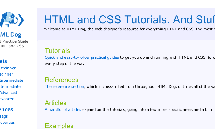
HTML Dog.com Screenshot

Here’s a great list of free places to learn the basics of HTML and CSS for those wanting to get started:

Additionally, we would recommend this new video tutorial series: Web Development from Scratch — from Nettuts+.

For a free intermediate level resource, see The MDC (Mozilla’s Doc Center).

Many thanks to the folks who put together this list in their send-up of W3schools.com — a site to be avoided. See W3Fools – A W3Schools Intervention.