Fix Twitter Bootstrap’s Dropdown Menus in Touch Screens

With Twitter Bootstrap’s 2.1 release, and running through the current version 2.2.1, dropdown menus have stopped working as they should in iOS and Android. Try to tap a submenu item, and the nav simply disappears. See the Github issue here. It is currently slated to be fixed in the upcoming 2.2.2 release, and I’m confident it will be addressed.

Until then, this quick little hack has worked for me. Add the following line of JS after Bootstrap’s bootstrap-dropdown.js (either in your own JS file or by adding it to Bootstrap’s JS):

$('body').on('touchstart.dropdown', '.dropdown-menu', function (e) { e.stopPropagation(); });

Since then, dropdown menus work as they should in iOS and Android, and I’ve noticed no adverse effects on non-touch devices.

Credit: @blakeembrey’s Github comment here

UPDATE for Bootstrap Version 2.3.2

@robdodson has posted this fix for version 2.3.2 in Github:

$('.dropdown-toggle').click(function(e) {
  e.preventDefault();
  setTimeout($.proxy(function() {
    if ('ontouchstart' in document.documentElement) {
      $(this).siblings('.dropdown-backdrop').off().remove();
    }
  }, this), 0);
});

A Little Twitter Bootstrap Book

For anyone who’d like a quick, friendly, step-by-step guide to Twitter Bootstrap basics, I’ve authored a little book for you, just released today.

Twitter Bootstrap Web Development Book Cover image
Twitter Bootstrap Web Development
Packt Publishing, November 2012
Buy Packt eBook (ePub, Kindle, PDF) or Print + eBundle
Buy Amazon paperback or Kindle edition

Contents include

  • Bootstrap’s responsive grid system
  • The responsive navbar
  • Typography, buttons, thumbnails, captions, and tables
  • Bootstrap’s excellent jQuery plugins, including
  • Drop-down menus
  • Tabbed content switching
  • Responsive carousel slider for images and captions
  • Use Bootstrap’s Customize page for basic customization of CSS and JavaScript
  • Recommended resources for going further with Bootstrap
In a word, this book is a brief, friendly introduction to the basics of using Twitter Bootstrap.
Warning: Because the book is brief, and basic, there are a slew of things it does not cover.

What this book does not cover

  • There’s no room for serious customization of Bootstrap’s built-in styles.
  • It’s not able to introduce you to working with Bootstrap’s LESS files.

I regret that. But again, the book is brief and basic. (I had constraints.)

Who would want to buy this book?

If you hate sorting through the documentation yourself, this little book will get you started. By the time you’re done, you’ll be ready to return to the Bootstrap docs with familiarity and confidence as you consult it and other recommended resources to keep rolling.

Is it up to date?

As up-to-date as I could make it! Version 2.1


New Content Coming …

Hi everyone,
I’ve been pleasantly surprised by the popularity of the Bootstrap, Roots Theme, and jQuery tutorials I posted last spring. I want you to know I’m laying plans to get back to it and ramp things up a bit. Currently, I’m working on an upgrade to this website, and soon I’ll be teaming up with a partner to start planning and producing next tutorials. Expect new content to start flowing in the coming weeks. And I’m hopeful that 2013 may be even more productive around here.

Thank you for your comments and prods to more activity. I enjoy this project and look forward to getting it rolling again. Soon.

Best regards,

David

Elements of a responsive web — or responsive web design’s role in the larger quest

Web GadgetsHi everyone,

I’ve been doing a fair bit of research on the latest thinking in responsive web design. Heady and exciting stuff.

One thing that quickly becomes clear is that responsive web design (see Ethan Marcotte’s book and add Luke Wroblewski’s Mobile First and Andy Clarke’s 320 and Up) is one key element in a larger matrix of elements that together make for a responsive web.

Other key elements include at least these:

  • Responsive Content — content carefully crafted and optimally adapted for your device (see Sara Wachter-Boettcher and Jeffrey Zeldman)
  • Responsive Asset-Delivery — just the files you need for your device, and make it quick! (see Paul Irish on this)
  • Responsive Interactions — the way things are going, we may need to capture clicks, swipes, pinches, waves, fist-bumps, back flips, and on and on (seen Leap Motion?)
  • Responsive Workflow — none of the above happens very well without informed participants working collaboratively to achieve great results (see Viljami Salminen’s “Responsive Workflow”)

I’ve probably left a few things out. But these categories help me get a handle on what’s going on and what everyone’s trying to make happen. It’s taking a lot of work, and it’s exciting to watch. (Don’t miss Aaron Gustafson’s Adaptive Web Design and Brad Frost’s recent how-to, demo, and reflection.)

I’m intrigued enough that I’ve started a little project to try to track these discussions:

  • RockinResponsive.com — currently only a homepage, but I intend to shape it into a great curated collection of “the best hits on the road to a responsive web”
  • @RockinResponsiv — I’m actively favoriting, tweeting, and retweeting here

LESS – CSS Syntax Highlighting in Panic Coda

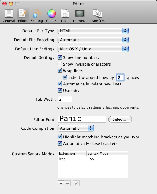
To turn on syntax highlighting when working with LESS files in Panic’s Coda (I’ve not upgraded to 2 yet):

  1. Preferences
  2. Editor
  3. Near bottom of that dialogue window, under Custom Syntax Modes: , press the +
  4. Type “less” for the extension
  5. For the Syntax Mode, pull down and select CSS.
  6. Press Okay.
  7. Close Preferences
  8. Re-open your LESS files. After opening, they should be highlighted like CSS files.

That’s it.

Many thanks to Bucsa Silviu for his tip!

Screenshots

coda-custom-syntax-modes

coda-extension-less


Fix? MacBook Air USB Ethernet

USB Ethernet Connected

I’ve got a 2010 MacBookAir3,1 — 1.6GHz Core 2 Duo — OS 10.6.8

I’ve had a terrible time getting my USB Ethernet adapter to work. Trouble both at home and at the office. Across 3 different adapters.

I’d get either of these messages:

“Self-assigned IP address”

or

“Ethernet is not connected”

After a couple of months of giving up entirely, I’ve done some research and have found a fix of sorts. Steps I took:

  1. In System Preferences > Networking …
  2. Created a new location, getting off the Automatic location
  3. Clicked the plus in the bottom left to create a USB Ethernet connection
  4. Under that connection, clicked the “Advanced …” button in the lower right
  5. Selected the Ethernet tab (farthest on the right)
  6. Edited the settings under that tab as follows:
    • Configure: changed from Automatically to Manually
    • Speed: 10baseT/UTP
    • Duplex: half-duplex
    • MTU: Standard

I’ll admit I don’t know what these settings do.

But suddenly my USB is recognized and works.

Though none supplied this fix, I gleaned ideas from these comments in Apple support pages, some of which led me in this direction.

Seems utterly strange to me that there are no published fixes rolled into Apple updates.

Reposition the Navbar in the Roots Theme for WordPress


UPDATE: Since I produced this tutorial, Roots has been updated so that its file structure is a bit different.From Joshua’s comment below (Thanks Joshua!):

The header.php file now pulls in a template part based on whether your theme setup supports bootstrap-top-navbar:

if (current_theme_supports(‘bootstrap-top-navbar’)) {
get_template_part(‘templates/header’, ‘top-navbar’);
} else {
get_template_part(‘templates/header’, ‘default’);
}

So now, to access the header to make changes to the bootstrap top nav bar you will need to go to:
your roots theme folder > templates > header-top-navbar.php.


In this short video, I’ll walk you through the steps to control positioning of the navbar in the Roots Theme for WordPress.

Roots Theme Customization – Position the Navbar from David Cochran on Vimeo.

Covered in this video:

  1. Create a copy of header.php so that you may revert back to the original navbar if desired.
  2. Modify the markup in header.php to remove the class "navbar-fixed-top" and (if desired) wrap the navbar within a div of class "container".
  3. In app.css, adjust the styles for .navbar-inner as needed (such as to remove border-radius).

Relevant Previous Videos

If you’ve missed them, here are video introductions to prior steps, for your convenience. (Pick what’s relevant and helpful!)

Create Dropdown Menu Items

Add your Custom CSS

Don’t miss the full Roots Theme series

This is the first installment of a longer series I’m developing on Roots Theme customization.

Additional topics include:

  • Getting Started
  • Use your custom page template for a static front page
  • More topics in the works …

Check out the full series here.

If you’d like an introduction to Twitter Bootstrap …

Twitter Bootstrap 101 by David Cochran at webdesign.tutsplus.comAgain this is another basic introduction, but if that’s what you’re after, I’ve got a Twitter Bootstrap video tutorial series underway at Webdesign.tutsplus.com.

Create a Custom Homepage with the Roots Theme for WordPress

Feb 21, 2013Hi everyone —

Roots has changed so much I need to re-work these tutorials. I hope to clear the space and start cranking them out soon. If you’d like, sign up for email notifications in the sidebar, so you’ll be notified when I’ve begun rolling them out again!

In previous videos, I have walked through the process of creating a custom page template with a custom loop. In this short video, I’ll walk you through setting a custom page as your site homepage (or front-page).

Roots Theme Customization – Custom Front Page from David Cochran on Vimeo.

Covered in this video:

  1. Select a custom page template for a page named “Home.”
  2. In the WordPress admin panel, under Settings > Reading, select this page as the “Static Front Page.”
  3. Remove the template file, front-page.php from the main theme directory, enabling the selected page template to control the page’s markup and layout.

Relevant Previous Videos

If you’ve missed them, here are video introductions to prior steps, for your convenience. (Pick what’s relevant and helpful!)

Create a Custom Page Template

Create a Custom Page Loop

Add your Custom CSS

Don’t miss the full Roots Theme series

This is the first installment of a longer series I’m developing on Roots Theme customization.

Additional topics include:

  • Getting Started
  • Reposition the Navbar
  • More topics in the works …

Check out the full series here.

If you’d like an introduction to Twitter Bootstrap …

Twitter Bootstrap 101 by David Cochran at webdesign.tutsplus.comAgain this is another basic introduction, but if that’s what you’re after, I’ve got a Twitter Bootstrap video tutorial series underway at Webdesign.tutsplus.com.

jQuery Form Validation with Styles from Twitter Bootstrap

Feb 5, 2013

This tutorial, the demo, and the jQuery code have been updated in light of excellent recommendations made by commenters.

Thanks all!

jQuery Form Validation ScreenshotThe jQuery Validate plugin by Jörn Zaefferer is a fantastic tool for providing users with immediate feedback while completing a web form. Used by Newsweek and others.

Here I’ve put together a working example, integrated with markup and styles from Twitter Bootstrap’s excellent front-end framework. The demo and sample files include markup, CSS, and JS.

See the Demo

Get the Sample Files