Getting a Grasp on Data Science: David Donoho’s Six-Part Definition

The discipline of data science is notoriously difficult to define, and yet it is perhaps not impossible. I am currently working to gear more of my thought and instruction around Stanford statistician David Donoho’s definition of Greater Data Science (GDS). Here I’ll provide a brief summary of three key contributions of Donoho’s argument, ending with his six-part definition of the discipline.

First, Donoho appropriately connects the current expansive discipline of Data Science to its roots in 50+ years of work by statisticians, beginning with John Tukey in the 1960s. On Donoho’s telling, contemporary Data Science should understand itself not in opposition to the discipline of statistics but as an outgrowth and extension of the long tradition of statistics. More than historical recognition, this extends to appreciating the contemporary relevance of both traditional statistical analysis and predictive modeling with machine learning. Just as traditional statisticians must acknowledge and embrace the importance and relevance of contemporary machine learning methods, “cutting edge” data scientists must appropriately recognize the continued role and relevance of traditional statistical analysis.

Second, Donoho helpfully identifies the Common Task Framework methodology that undergirds the successes of contemporary predictive modeling. This methodology includes (a) a publicly available training dataset, (b) a competitive multi-party approach to predictive modeling, and (c) a scoring referee or system for evaluating the competing models against a test dataset unavailable to the competitors. He cites the Netflix Challenge as a famous example of this approach.

Third, and most importantly, Donoho builds on the work of John Chambers and Bill Cleveland to outline a definition of Greater Data Science (GDS), which includes the following six sub-fields:

  1. Data Exploration and Preparation
  2. Data Representation and Transformation
  3. Computing with Data
  4. Data Modeling
  5. Data Visualization and Presentation
  6. Science about Data Science

This definition is so apt that it seems common sense to those who practice in the field. But the complexity of the work involved in data science has meant that reaching the clarity offered by this definition has not been easy. Not content simply to define, Donoho devotes the remainder of his piece to discussing and illustrating some of the key practices included under each sub-field. I will number each sub-field as he does, using GDS for Greater Data Science.

GDS1: Data Exploration and Preparation. Frequently requiring upwards of 80% of the work involved in data science, this sub-field is too often neglected in the teaching of data science and merits greater attention in the future. It includes the many steps of curating data, dealing with anomalies, and pulling into the shape needed for analysis.

GDS2: Data Representation and Transformation. This includes the problem of data storage and requires that a data science be fluent in current database technologies. As of 2021 that includes SQL and NoSQL databases, distributed (cloud) systems, etc.

GDS3: Computing with Data. This includes necessary knowledge of languages like Python or R and related current software used in preparation, analysis, and modeling, as well as understanding of the workflows used to in the development of an analytical process. 

GDS4: Data Visualization and Presentation. This sub-field addresses the importance of visual analysis methods, from standard plots used in Exploratory Data Analysis (EDA) to advanced charts used to crystalize understanding of specific important features to interactive data dashboards.

GDS5: Data Modeling. This sub-field should rightfully include both traditional statistical approaches and contemporary predictive modeling with machine learning.

GDS6: Science about Data Science. Key to making data science a true science, science of data science investigates the real-world work of data scientists “in the wild” and contributes to the documentation, description, analysis, and evaluation of those real-world practices, with the express aim of discerning the more fruitful practices that show merit for leading the discipline of data science forward to greater promise and productivity.

Given the sheer complexity of data science and the astounding speed of its ongoing development, it is difficult to overstate the value of Donoho’s six-part definition of the discipline. For myself, I will be contemplating and engaging the implications of this definition for months and years to come.

Allow me simply to recommend Donoho’s article as a read of incredible value, and recommend his helpful discussions of these six sub-fields as a beginning point for others as we work together to take the discipline forward.


Statistics for Data Science

Statistical knowledge is immensely valuable to our work in data science. Indeed, the field of statistics has helped shape the realities we work in, including the software tools and algorithms we have available. Those with deep statistical knowledge play key roles in shaping the future of the field.

However, the individual practitioner in Data Science need not have a PhD in statistics or mathematics to be successful. Indeed, our everyday use of statistics proper is often strategic, empowered by software, and requires more of an intuitional grasp of key statistical concepts than deep knowledge.

As Vincent Granville wrote in 2014:

Data science barely uses statistical science and techniques.

He goes on to clarify:

The truth is actually more nuanced …

In the ensuing post he lists a series of new statistical concepts that are frequently useful in data science, followed by a series of old statistical concepts that are also often useful.

Then he follows up with this sentence:

From a typical 600-pages textbook on statistics, about 20 pages are relevant to data science, and these 20 pages can be compressed in 0.25 page.

Granville’s post is worth a read, as he goes into some reasons why old-school statistics proper is increasingly less useful in the world most of us live and work in, while machine learning techniques are becoming much more useful.

And I will add: Granville’s post, while framed somewhat controversially, fairly well summarizes the realities of data science work. There are several statistical concepts that are indeed useful when doing this work. But we have powerful software tools ready at hand to do much of that work — often using new techniques that yield better predictive results than older statistical approaches do.

Yes, we still often need to understand the meaning and implications of a range of statistical insights in relation to our data. But we can get lots of great work done with an intuitional understanding of those concepts. Thus, we can start with statistical fundamentals, use them as needed, and then expand our knowledge when the situation calls for it.

One last sentence from Granville summarizes this data-sciencey attitude toward stats:

I believe that you can explain the concept of random variable and distribution (at least what you need to understand to practice data science) in about 4 lines, rather than 150 pages. The idea is to explain it in plain English with a few examples.

Granville expressed an intention to draft a “statistics cheat sheet for data scientists,” and do it in a single page. If he ever wrote that, I’ve not found it.  Turns out he wrote a Machine Learning Cheat Sheet that covers many data sciencey things, but not statistics.

Meanwhile, in 2017, O’Reilly published a nice handbook of 318 well-organized, succinct and readable pages to fill the gap: Practical Statistics for Data Scientists, by Peter Bruce and Andrew Bruce. I recommend it:

Practical Statistics for Data Science cover

For most of us, a work like this does a great job of bridging the gap for those who are coming to data science from a variety of fields.

Getting Started with Tableau Desktop

If you’re fairly new to Tableau, chances are you’ll find Tableau’s repository of free training videos (free with registration) to be very helpful. Indeed, there’s enough there to help you go from zero to serious just about as fast as you dare to do it. The tutorials are really pretty great.

BUT their organization scheme needs a little help.

Here’s a helpful list of the best, most useful videos to get started with. Once you’ve worked through those, check out my page with a more extensive organized index including Tableau’s more in-depth training videos.

Tableau Fundamentals

The following seven videos will get you up and running quickly.

From the Getting Started section

  1. Getting Started (25 min)
    A little lengthy, but does a great job of giving an overview of what’s possible in Tableau.
  2. The Tableau Interface (4 min)

From the Connecting to Data section

  1. Getting Started with Data (6 min) 
  2. Managing Extracts (4 min)

From the Visual Analytics section

  1. Getting Started with Visual Analytics (6 min)

From the Why is Tableau Doing That? section

  1. Understanding Pill Types (5 min) 
  2. Measure Names and Measure Values (5 min)

From this point forward, the best path depends on your needs. 

Check out my page with a more extensive organized index including Tableau’s more in-depth training videos.

On the Differences between Statistics and Machine Learning

In his post, The Actual Difference Between Statistics and Machine Learning, Matthew Stewart helpfully explains how statistical analysis differs from machine learning. Data science is still a larger than machine learning. But it’s very appropriate to say something very similar about the relationship between the two as we said above: Data science can’t be done without machine learning.

Both statistics and machine learning are part and parcel of the data science toolkit. And each plays a somewhat different role. Explaining the difference is helpful.

Stewart summarizes the difference like this:

  • Statistical modeling aims first and foremost for understanding and explaining relationships between variables. Predictive power is a secondary consideration.
  • Machine learning aims first and foremost for effective prediction. Some machine learning algorithms are easy to interpret, and some are not.

Thus, if you are writing a scientific paper that needs to explain the relationships between variables, statistical modeling is probably the best route.

However, if the point of your work is to produce actionable results that translate into greater efficiency and effectiveness achieving the mission of your organization — machine learning is often the better route.

In Stewart’s own words:

Machine learning is all about results, it is likely working in a company where your worth is characterized solely by your performance. Whereas, statistical modeling is more about finding relationships between variables and the significance of those relationships, whilst also catering for prediction.

He goes further to develop a helpful analogy:

By day, I am an environmental scientist and I work primarily with sensor data. If I am trying to prove that a sensor is able to respond to a certain kind of stimuli (such as a concentration of a gas), then I would use a statistical model to determine whether the signal response is statistically significant. I would try to understand this relationship and test for its repeatability so that I can accurately characterize the sensor response and make inferences based on this data. Some things I might test are whether the response is, in fact, linear, whether the response can be attributed to the gas concentration and not random noise in the sensor, etc.

Statistical analysis is great in such a case. It’s the right tool for the job.

But what if the nature of the problem is slightly different, and the goals are different?

In contrast, I can also get an array of 20 different sensors, and I can use this to try and predict the response of my newly characterized sensor. This may seem a bit strange if you do not know much about sensors, but this is currently an important area of environmental science. A model with 20 different variables predicting the outcome of my sensor is clearly all about prediction, and I do not expect it to be particularly interpretable. This model would likely be something a bit more esoteric like a neural network due to non-linearities arising from chemical kinetics and the relationship between physical variables and gas concentrations. I would like the model to make sense, but as long as I can make accurate predictions I would be pretty happy.

That brings it home nicely. In the case of machine learning, our interest is in the results: How can we make the most accurate predictions? And moreover, do these predictions yield benefits for the mission of our organization?

Perhaps said otherwise, statistics is more about understanding — helping to answer the question, What’s really happening here? Machine learning is more about driving action — helping to answer the question, What can we anticipate next? — and by extension enabling efficient and effective responses.

Tom Khabaza’s Nine Laws of Data Mining

Those who work in data mining or predictive analytics are familiar with the CRISP-DM process. Metaphorically, if not literally, that process description is taped to our wall. Tom Khabaza’s Nine Laws of Data Mining should be taped up right next to it.

Khabaza has published those laws as a series of blog posts, here. For each law, he has provided a short name, followed by a one-sentence summary, supported by a few paragraphs of explanation.

The value of these laws is that they help prepare us for what to expect as we do the work — and then they remind us of what we should have expected if we occasionally forget!

As I am a fan of brevity, I’m creating this post as a list of the single-sentence summaries. Occasionally I’ll add a short clarifying note. Here they are:

Tom Khabaza’s Nine Laws of Data Mining

  1. Business objectives are the origin of every data mining solution.
  2. Business knowledge is central to every step of the data mining process.
  3. Data preparation is more than half of every data mining process.
  4. The right model for a given application can only be discovered by experiment (aka “There is No Free Lunch for the Data Miner” NFL-DM).
  5. There are always patterns (aka “Watkin’s Law).
  6. Data mining amplifies perception in the business domain.
  7. Prediction increases information locally by generalization.
  8. The value of data mining results is not determined by the accuracy or stability of predictive models. (Rather, their value is found in more effective action and improved business strategy.)
  9. All patterns are subject to change. (Thus, data mining is not a once-and-done kind of undertaking.)

These laws, as Khabaza points out, are not telling us what we should do. Rather they are “simple truths,” describing brute facts that give shape to the landscape in which data mining is done. Their truth is empirical, discovered and verified by those who’ve been doing the work. So it’s best to keep these truths in mind and adapt our efforts accordingly, lest we pay the price for failing to acknowledge reality as it is.

If you’re intrigued, and want to read further, view Khabaza’s full post here. His exposition of these points is more than worth the time!

Setting up an AWS Cloud Database to Support Student Projects — AWS Educate

If you’re an educator (or student) interested in leveraging Amazon Web Services through AWS Educate to host a cloud database that allows student connections — this post is for you. In what follows, I’ll document the process to:

  • Configure and create a relational database instance from the AWS Management Console.
  • Set a security profile that will allow students to read and write to the database remotely — such as from a database client, from a program they’ve written, from a Jupyter Notebook, etc.
  • I’ll illustrate the process by creating a PostgreSQL database instance. Then I’ll provide illustrative code snippets for interacting with the database using Python.

The resulting database will be friendly for student projects that include database interactions such as querying, reading, and writing.

I’m going to assume that you’ve already created your Amazon Educate Account and are logged into your AWS Console. Thus, we’ll begin by creating a relational database.


Creating a Relational Database in the AWS Console

Once you have logged into your AWS Console, these are the steps to set up a relational database.

  1. Use the search field under “Find Services” to search for “RDS.” You should see RDS: Managed Relational Database Service appear in the results. Select and navigate to the RDS page.Search for RDS in AWS Console
  2. Once you’ve arrived at the Amazon RDS page, select Databases in the left-hand sidebar, and then Create Database.RDS Create Database
  3. From the Create Database page, select your desired options for creation method and configuration. You are free to choose differently, of course, but I have chosen these options:
    • Standard Create — This will allow me to optimize the resources my database will use.
    • PostgreSQL — A favored option among data science types. But choose what’s best for you!

      Choose creation method and database engine.
      Choose your desired creation method and database engine.

  4. Select your desired Template (the labels here may depend on the engine you choose) according to your needed system resources and the size of your budget. I currently have access to the free tier, which I’ll use now. If that were not available, Dev/Test is the next least resource-intensive option I currently have.

    Choose the template according to your needed resources
    Choose the template according to your needed resources.

  5. If you desire, edit the database name (identifier), master username, and password.Provide desired names and password
  6. Choose the DB instance size and storage (if relevant) that suits your needs and budget. I’ve chosen the least resource-intensive options, as these will be plenty for my intended use: basic CRUD operations performed by my students.

    Choose instance size and storage
    Choose instance size and storage according to the resources you need.

  7. Under Connectivity, select “Additional connectivity configuration” and then “Yes” under Publicly accessible.Connectivity choose publicly accessible
  8. You’ll be given the option to create a new security group. You can keep the default, or create a new group. I’ve created one named “students.” You’ll also see the database port settings.Security group settings
  9. Depending on your selected database engine, you may (or may not) be given the option to choose Database authentication. With the PostgreSQL database I’ve chosen, I have these options, and I’ll choose Password authentication.Database authentication options
  10. Depending on your selected database engine, you may (or may not) be given Additional configuration options. If you’re unsure about these options, click the handy Info link to read more about them. I’ve deselected automatic backups in order to conserve resources.Additional configuration options
  11. If all looks good, click Create database!Click Create
  12. After clicking create, you may be given a message to go back and adjust a configuration option. If so, go back and do that. If all went well, you’ll be taken to a confirmation page. Here’s what mine looked like:Creating Database Confirmation
  13. Notice that you can click to View credential details — a handy way to get the login information and save it for future reference!


Congratulations! You’ve created your database!

Now we need to set a security rule to allow interactions with the database.


Allowing Inbound Traffic

In these next few steps, we’ll set a connection security rule to allow inbound traffic to interact with the database.

  1. Beginning at the RDS > Database page, click the database identifier.
    13_Click_to_Configure
  2. Select the Connectivity & security tab.13b_Select_Connectivity_Security
  3. Scroll down the page to Security group rules, and click to edit the Inbound rules.13a_Click_Edit_Inbound_Rules
  4. If necessary, select Actions, and Edit inbound rules.13b_Edit_Inbound_Rules
  5. There should be an initial rule begun for you. Notice that the Type and Port range are already set to match your database settings. Now we need to allow a range of IP addresses. Configure this according to your needs. In my case, I’ll be working with online students. And since the database will not contain sensitive data, I’ll simply pull down the box under Source and select “Anywhere,” to allow traffic from any IP address.14_Inbound_Rule_Anywhere
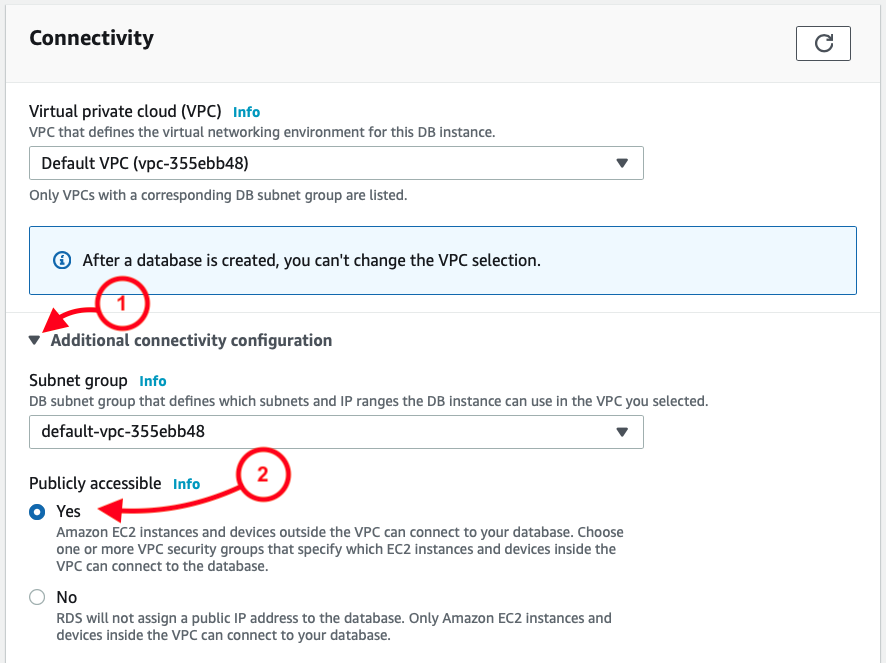
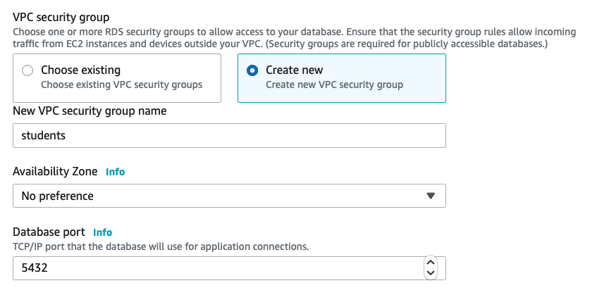
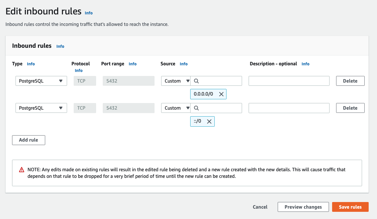
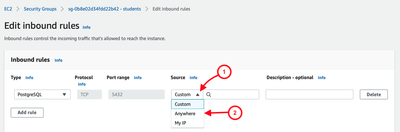
Once that’s been selected, I then see the result as two rules, allowing a full range of IP address options:
    15_Inbound_Rules
  6. Click Save rules!


Connecting to the Database

After creating the database, you can connect to the database using an application or database management package. You’ll simply need a few key items of information. These were supplied when you first created the database. The items include:

  • Endpoint (aka host or hostname)
  • Port
  • DB name
  • Master username
  • Password

If you need to recover these later, you can do so by selecting the database from the RDS database list, and then looking under the two tabs: Connectivity & security, and Configuration.

The Endpoint (aka host or hostname) and Port can be found under the database Connectivity & Security details:

AWS database connectivity page


The DB name and Master username can be found under the Configuration tab:

AWS database configuration page


As for the user password, you will hopefully have recorded or remembered it!

Those provide the essential credentials you’ll need to connect to the database.

In the next section, I’ll illustrate using these credentials to connect to the database, create a table, insert records, and query the table using Python.


Interacting with the Database Using Python

Python provides modules for connecting to any number of database engines. Since I selected a PostgreSQL engine, I’ll be using the psycopg2 module to interact with it. (For a MySQL database, you can use pymysql. And so on …)

If the module is not currently installed on your system, you’ll need to install it. In Python, this may be done easily using pip or conda:

Once the module is installed, you’ll simply import it to use it in your Python application or Jupyter notebook:

import psycopg2


Next we’ll establish the connection, using the psycopg2.connect() method, and providing the database information and login credentials, such as follows:

Establish database connection using psycopg2.connect()

Then you can use lines such as follows to interact with it. (See the psycopg2 docs for guidance.)

# Start the cursor to enable SQL operations

cur = conn.cursor()

# Create a table
cur.execute("CREATE TABLE test1 (id serial PRIMARY KEY, num integer, data varchar);")

# Insert a record
cur.execute("INSERT INTO test1 (num, data) VALUES (%s, %s)", 
(101, "abcdefg"))

# Query the table
cur.execute("SELECT * FROM test1;")

# Output the query results
cur.fetchall()

# Commit the changes
conn.commit()

# Close the connection
conn.close()


In Closing

That’s it! Your database is ready to roll.

AWS Educate provides a fantastic opportunity to equip students with cloud resources. In fact, it’s worth pointing out that both educators and students can follow these steps. If a professor should want students to create their own cloud databases for their projects, the above steps will serve them just as well.

I hope this resource proves helpful. Please comment with feedback, suggestions, and recommendations!

Two Cheers for Penguins Data!!

I’m excited about this penguins data set which has just been made publicly available. This will be much more fun for student projects than the old standard iris data set.

Penguins cartoon to illustrate the penguins data set

The data is from a published study on Antarctic penguins. It offers great opportunities for regression analysis, cluster analysis, etc. Here are two sample charts from the Github Readme:

Histogram of penguin flipper lengths colored by species


Scatterplot of culmen length and depth clustered by species

What’s a culmen you may ask? They’ve illustrated that nicely:

Illustration of a penguin culmen

Links and Credits

The data set is available at Github here: https://github.com/allisonhorst/penguins 

A CSV file of the full data set is available in the data-raw sub-directory. Here is a direct link. (You can view the raw version and then save it as a CSV file from your browser.)

Data were collected and made available by Dr. Kristen Gorman and the Palmer Station, Antarctica LTER, a member of the Long Term Ecological Research Network.

The data was used in the published study freely available here:

Gorman KB, Williams TD, Fraser WR (2014) Ecological Sexual Dimorphism and Environmental Variability within a Community of Antarctic Penguins (Genus Pygoscelis). PLoS ONE 9(3): e90081. doi:10.1371/journal.pone.0090081


Tableau Tip: Group Years into Decades Using Calculated Fields

In a recent Tableau project, I wanted to divide a long span of years into decades, as this would provide a more visually effective way to grasp the growth of revenue from top movies (data from The Movie Database) over time. With a little searching, I found the pieces I needed. Below I’ll include a description of my process, followed by links to the helpful sources of insight I found on this topic.

First, here is the visualization with total revenues year by year. Notice that despite its current width you still have to scroll left to reach the early 1900s. Meanwhile, the difference year to year is not in itself that interesting.

Top TMDB movie revenue totals by year a partial view

Now here is the visualization when years are chunked into decades. Much more effective!

Top TMDB movies total revenue by decade

DISCLAIMER: These charts use revenue numbers as entered in The Movie Database by contributors based on publicly reported figures. Thus, the data includes only a portion of all movies. I’ve as yet made no adjustments for inflation.

Getting to Decades from Dates

Now for the process of getting decades from dates. I broke my approach into two steps:

  1. I first created a calculated field to pull the Year from the Release Dates field, using Tableau’s DATEPART function.

    Calculated field to get only the Year from the date information in Release Date

    Once that field was created, I moved the new calculated field from Measures to Dimensions, where it should be.

  2. Then I created a Decades dimension as an additional calculated field. This calculation uses Year and the modulo operator to round each year down to the nearest multiple of 10.

    Calculated field to round each year down to its decade using modulo

    Then, similarly, once created, I made this calculated field a Dimension.
    That’s all it took!

Many thanks to Nick Parsons and Erik Bokobza for their helpful replies in the Tableau Community Forums. Links below.

Recommended Reads

Why does Excel keep mangling my date formats! When my date range spans multiple centuries …

When working with a date range that spans multiple centuries (for instance, late 1800s to present), it’s important to know a few things before viewing or saving the data in Excel. (I’m currently working with Excel 365 for Mac and Excel 2016 for Windows.)

Suppose you’re working with data stored in a CSV file and want to examine it in Excel. Here is a short list of things to watch out for:

  1. Excel for Mac automatically formats dates in m/d/yy format, shortening years to two digits in the process. (Thus 1915-02-08 becomes 2/8/15!) If you then save back to CSV, it will overwrite four-digit years to two, thereby ruining your date fields — as there will be no record of which century it’s from. You’ll need to go back and recover four-digit years from your source. This is bad.
  2. Excel for Windows defaults to m/d/yyyy format. This is not so bad, as the full four-digit year values are maintained.
  3. Neither Excel for Mac or Windows recognizes dates before 1900, instead treating such dates as text. (Thus 1898-01-01 remains ‘1898-01-01’, as text.) On the plus side, it does not change the formatting of these dates.
  4. For the above reasons, if you view date fields in Excel for Mac or Windows, it makes good sense to immediately format your dates to yyyy-mm-dd (following the international standard for data formats: ISO 8601). This requires using custom formatting in Excel. But it’s effective and can save your bacon. (Plus, it jibes with Python pandas and R.)

To reformat dates in ISO 8601 format in Excel for Windows:

  • Go to Format Cells and select the Number tab.
  • Then use the Custom category, and type in the formula: yyyy-mm-dd

Reformat dates to ISO 8601 yyyy-mm-dd in Excel for Windows

In Excel for Mac, the process is similar, but the option we need is (currently) available under the Date category:

  • Go to Format Cells and select the Number tab.
  • Then use the Date category, and select the option starting with a four-digit year, followed by a two-digit month and two-digit day, with hyphen separators. (Excel for Mac currently displays this with the sample date: 2012-03-14.)
  • Alternatively, do as in Windows Excel, and enter it as your own Custom format: yyyy-mm-dd.

Reformat dates to ISO 8601 yyyy-mm-dd in Excel for Mac


For Further Reading